The Devil’s Artisan
‘Though an angel should write, / still ’tis devils must print.’
— Thomas Moore (1779–1852)
P22 TYPE SPECIMENS
BY RICHARD KEGLER
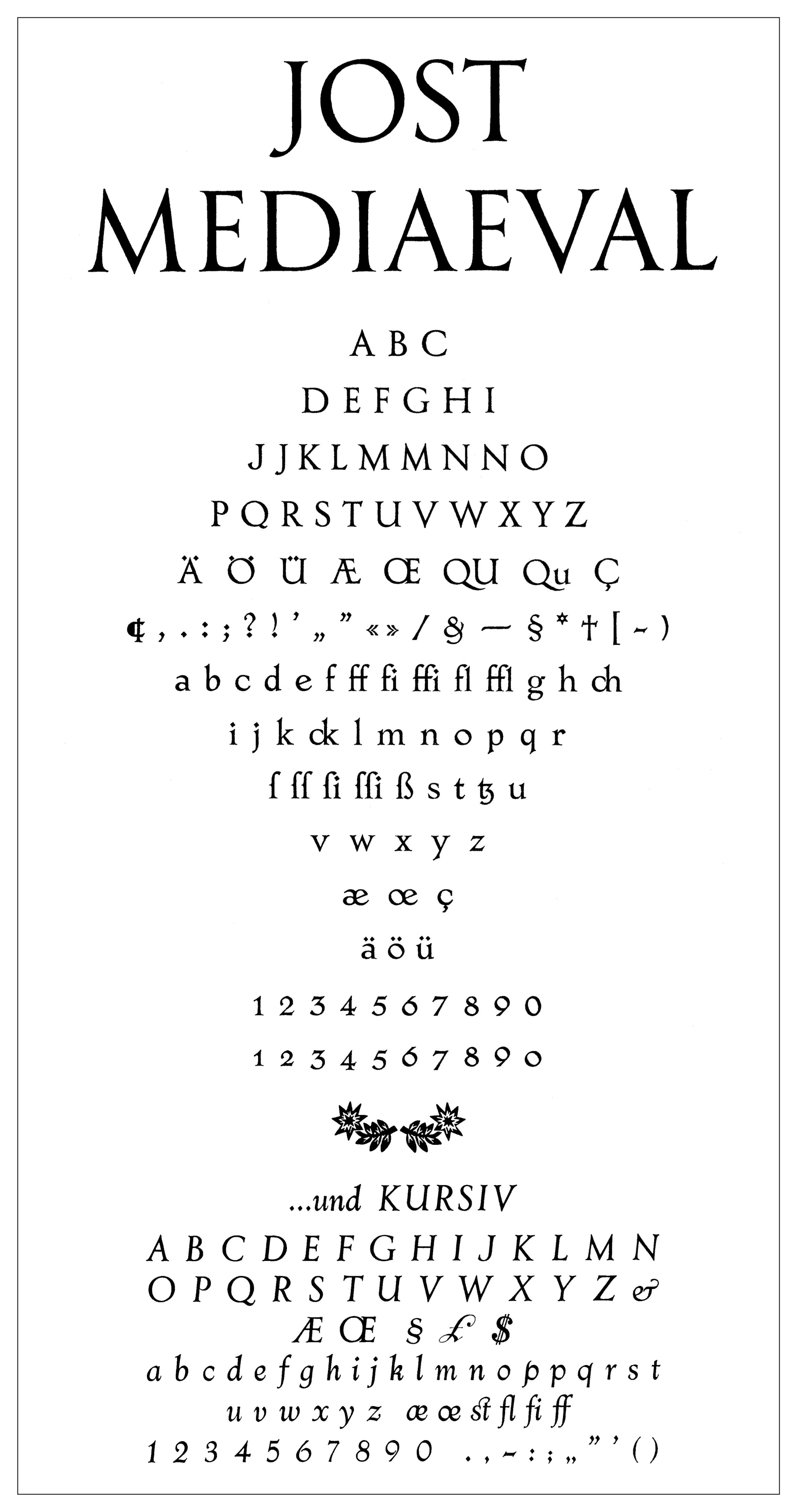
Jost Mediaeval Type
German type designer Heinrich Jost (1889–1948) was the art director of the Bauer Type Foundry from 1923 until 1948. He is most well known for his own type designs: Bauer Bodoni and Beton. A type design not as well known by the design world is his Jost Mediaeval, released not through Bauer but rather the Ludwig & Mayer foundry in 1927.
Jost Mediaeval was designed with references to the lettering styles of early calligraphers and punch cutters but conspicuously combined with some modern sensibilities. The slow tapered serifs evoke calligraphic brush strokes. The Venetian quality of the angled head serifs and e crossbar are contradicted by a relatively modern high weight contrast and open lowercase counters.
The advertising specimen booklet for the font draws attention to this contradiction between two opposite directions—with rudimentary translation from German: ‘on the one hand those old typefaces are dug up and re-cut ... in the style of past centuries and on the other hand the very modern in the spirit of the so-called elementary typography, in the style of pure objectivity.’ Unlike Jost’s Bauer Bodoni, which is regarded as one of the most faithful revivals of Giambattista Bodoni’s original, Jost Mediaeval is overall a rather quirky type style avoiding any direct ‘slavish imitation’ of previous designs, and it becomes even more quirky in its Italic (Kursiv) form. It truly has a feel for its time of casting off the excesses of the late nineteenth century with awkward steps towards modernism. The pinnacle of modernist type design would be released barely a year later in Paul Renner’s Futura, released under Jost’s guidance at Bauer in 1928.
The Devil's Artisan would like to acknowledge the generous financial support of the Canada Council for the Arts and the Ontario Arts Council.