The Devil's Artisan
‘Though an angel should write, / still ’tis devils must print.’
— Thomas Moore (1779–1852)
A ROGUES' GALLERY
OF THE CANADIAN BOOK AND PRINTING ARTS
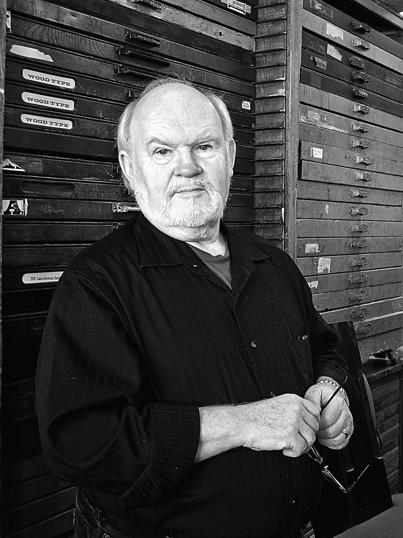
Rod McDonald
Rod McDonald worked as a lettering artist and sign painter until he was almost thirty years old. Even after moving to Toronto to become involved in the photo lettering business, Rod was at first still primarily a hand lettering artist. Sometimes he was asked to help adapt typefaces for photo text setting, and it was this work that sparked his consuming interest in typography.
Rod worked on staff or as a freelancer for legendary companies such as Cooper & Beatty and Mono Lino Typesetting. He eventually designed alphabets, wordmarks and symbols for numerous corporations and publications—from General Motors to Canadian Business.
While working at Mono Lino Rod took up the serious study of Carl Dair and, in particular, Cartier, the first Latin typeface designed in Canada. Dair’s design was in some ways problematic. Rod wanted to produce a true textface design, and set to work refining and expanding Dair’s design. The result was Cartier Book, released in 2000.
Rod’s career since then has been a blur of activity, and stellar accomplishment. Now based in Lake Echo, Nova Scotia, he is highly respected as a typographic designer, prolific writer (especially for Applied Arts magazine), educator and in-demand speaker. In 2001 Rod was hired to help redesign Maclean’s magazine; this was the first time a Canadian magazine had commissioned a custom typeface. The result was Laurentian, which has become a popular text typeface. Rod’s subsequent commercial type designs include Smart Sans (2004), Slate (2006), Gibson (2011) and Classic Grotesque (2012).
In 2012, Rod McDonald was elected a Fellow of The Society of Graphic Designers of Canada (GDC). He has been active in international typographic organizations, and has been awarded the Monotype Type Design Imaging Fellowship twice.
The Devil's Artisan would like to acknowledge the generous financial support of the Canada Council for the Arts and the Ontario Arts Council.
Rod McDonald